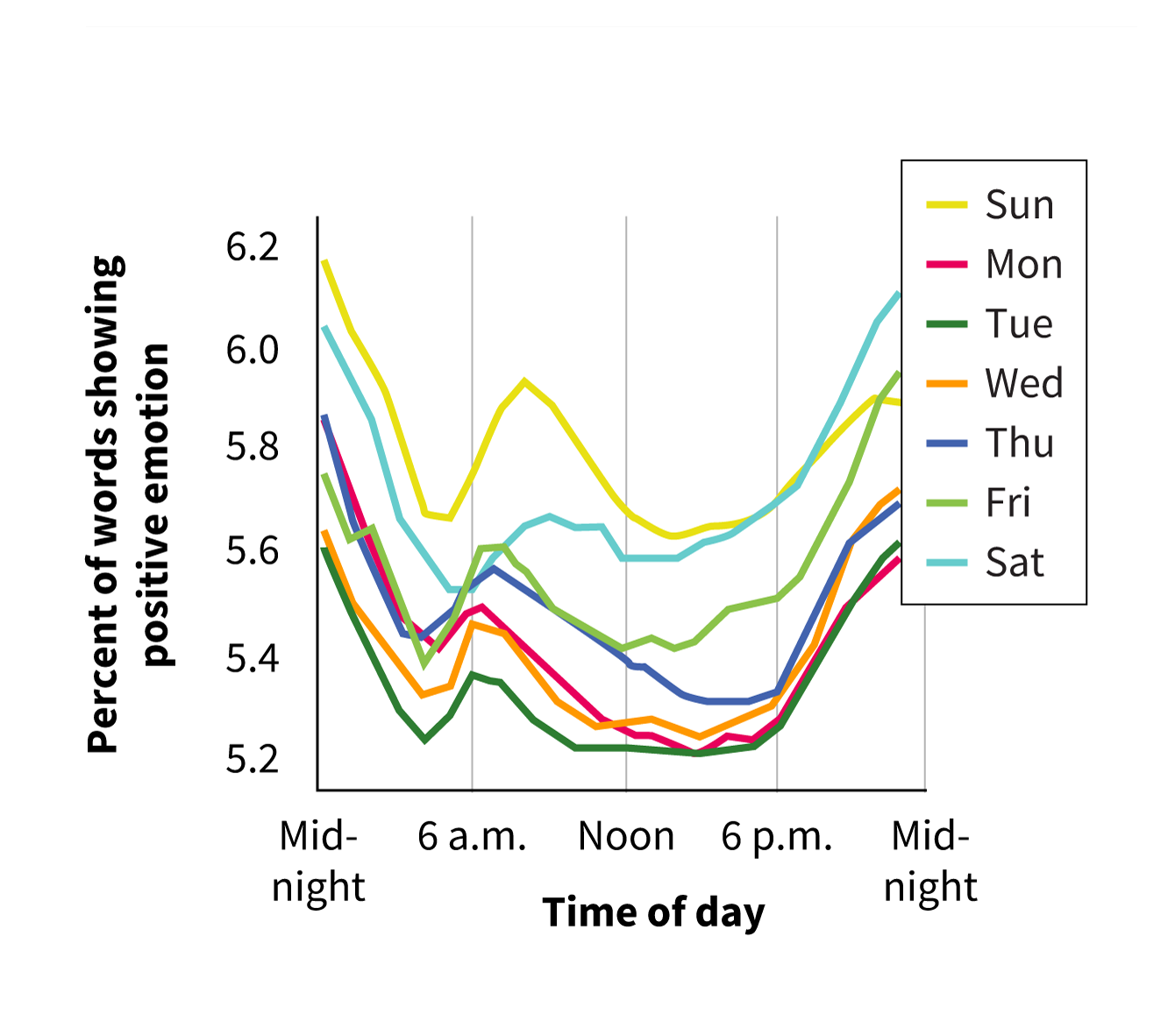
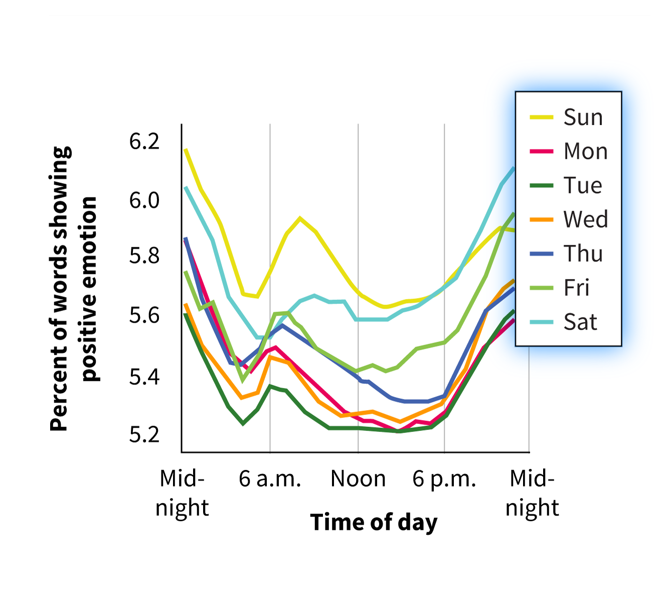
Select the y-axis label.
Correct! Positive emotion was the main variable in the study. It was operationalized by counting the number of positive emotion words used on Twitter and converting that to a percentage of total words used.
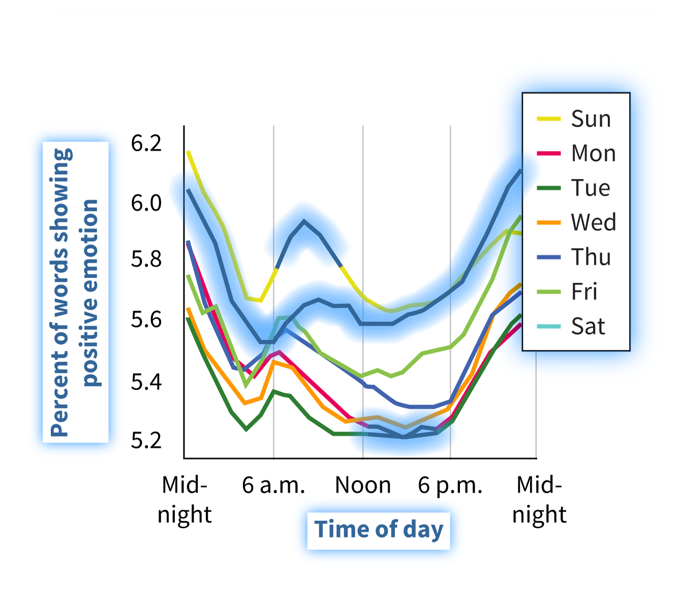
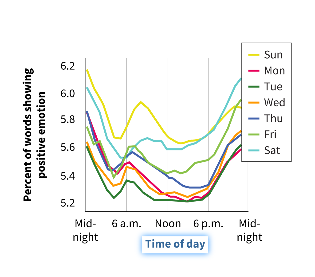
Select the x-axis label.
Correct! This refers to the hour of the day. This graph shows all 24 hours of the day from midnight to midnight. If this graph is showing emotions over the course of a day, and there are seven days in a week, how can we make sense of the provided information?
Select the legend.
Correct! The legend shows that each colored line represents a different day of the week. Altogether, this graph represents the percentage of positive emotion words expressed on Twitter across the 24 hours of each day of the week. But what exactly is this graph telling us?
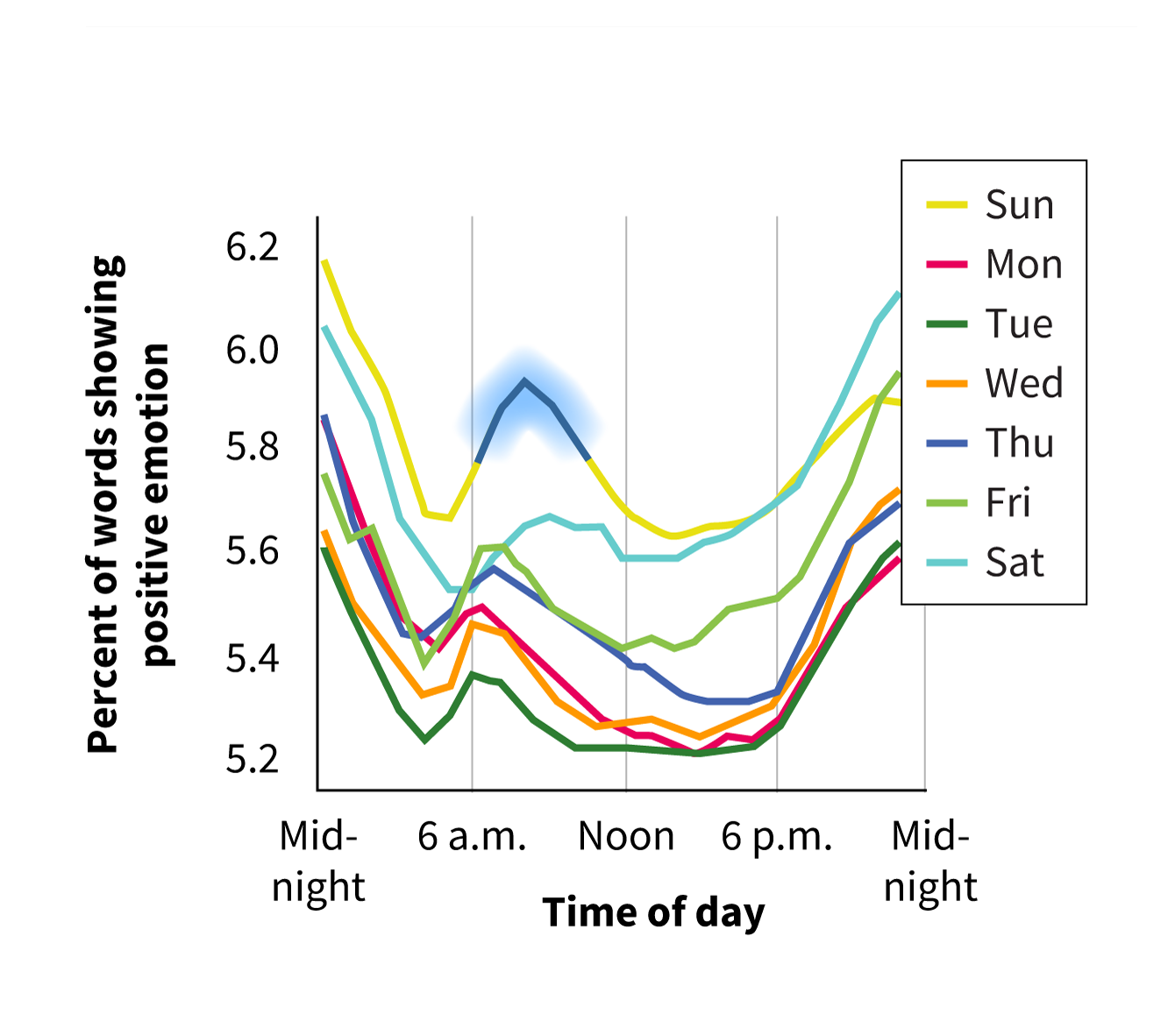
Select the peak between 6 a.m. and 6 p.m.
Correct! The authors argued that “positive affect follows a rhythm throughout the day, peaking in the morning and again at night.” The first peak occurred at about 8:00 a.m. (according to the x-axis) on Sundays (gold-colored line).
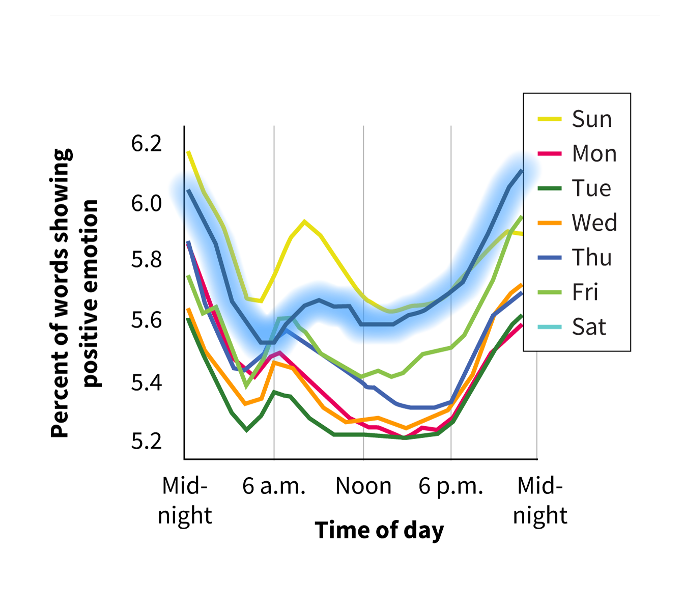
Select the line that represents Saturday.
Correct! Although all the lines have similar shapes, the lines for Saturday and Sunday are higher than the other five lines. This means that people used a higher percentage of positive emotion words overall on weekend days than on weekdays.
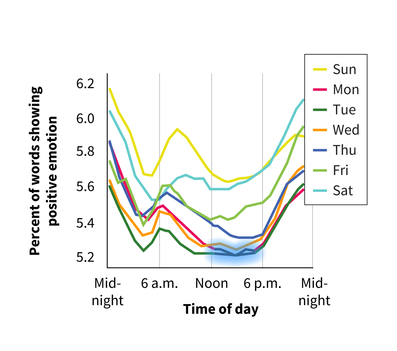
Select the time(s) of the week when people used the fewest positive emotion words.
Correct! People used the fewest positive emotion words on Twitter in the early afternoon on Mondays and Tuesdays.